
Why Storybook + Zeplin
Storybook is an open-source repository to build, test, and document components and pages in isolation. Zeplin has both a Storybook integration and an addon. Access code and documentation while inspecting components in Zeplin with the integration. See Zeplin designs in Storybook using the addon.
Need help?
Ping us at support@zeplin.io or check out our troubleshooting guide for common questions.
Connect design components to code
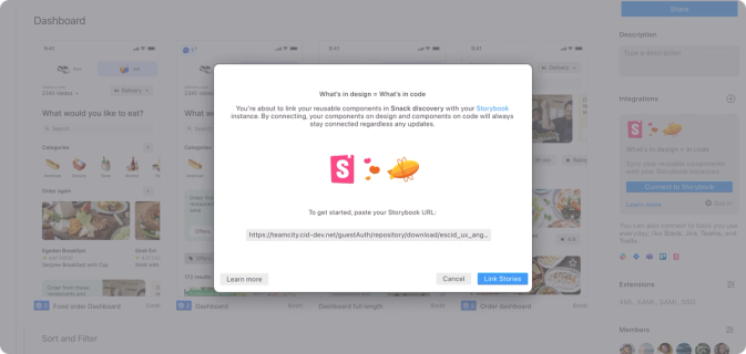
Paste your Storybook instance URL to a Zeplin project or styleguide to get rolling. Then link components one by one; Zeplin will suggest design components to match what's found in Storybook.
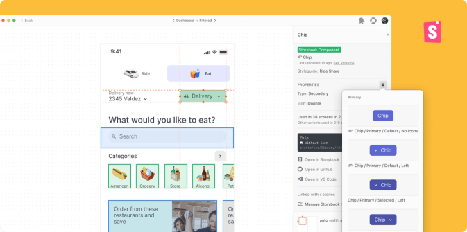
Highlight built components in designs
Toggle to highlight Storybook components that have already been built on each screen. Skip the rework and see supporting information including code snippets, link status, and link to directly edit in Storybook.
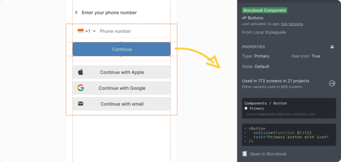
Compare code to final designs in addon
See a side-by-side comparison between live code and design in Zeplin's addon for Storybook — it’s that simple.
Note: Zeplin’s integration works with React, Vue, Angular, and all 15 frameworks that Storybook supports.
Connect your Storybook instance to Zeplin
- In any project/styleguide dashboard, click on the + button on the Integrations section of the right panel and select “Connect to Storybook”.
- In the modal that pops up, copy-paste your Storybook instance URL and click the “Link Stories” button to connect.
- ☝️ If you’re using the Zeplin web app, you’ll need to install Zeplin's Storybook addon to connect with Storybook.
- Once installed, you’ll be navigated to the Storybook integration page to start linking components in Zeplin with stories in Storybook. You can link your entire Zeplin project/styleguide to your global story parameters (recommended) OR link individual components one by one.
Install the Zeplin addon for Storybook
- Requirements: Storybook 5.0.0 or higher.
- This addon works with any framework. If you run into issues, please let us know.
Related Integrations

Jira
Connect for live, two-way collaboration

VS Code
Access designs, follow changes, and open attached Jira issues

Figma
Separate design explorations from ready-to-build work