An organized workspace
to communicate design intent
You shouldn’t have to choose between precision and creativity. Zeplin ensures that the final product reflects the designs you intended for build.

Let AI catch issues before handoff
AI Design Review looks over your screens and flags the easy-to-miss stuff before handoff — inconsistent spacing, off-brand colors, missing states. A quick second pair of eyes, right when you need it.

Cut out design file prep
Organize your design and present it with clarity. You can finally document your design without extra layers cluttering your workspace.
Zeplin is the source of truth for finalized designs, if it’s not in Zeplin it won’t be in the shipped product.
 Alan Chappell Head of UX @Box

Deliver finalized, locked designs
Regardless of whether you use Figma, Adobe XD, or Sketch, you can publish your “locked” designs to Zeplin, with Commit Messages to note changes in each version.
By simply sharing a link to Zeplin with anyone who needed access to a particular design, we opened up involvement in testing and reviewing to more non-designers
 Davide Pisauri User Experience Designer @Luxottica

Better organization boosts productivity
Ensure your designs are easy to find and access, especially as your team grows and more designs are added.
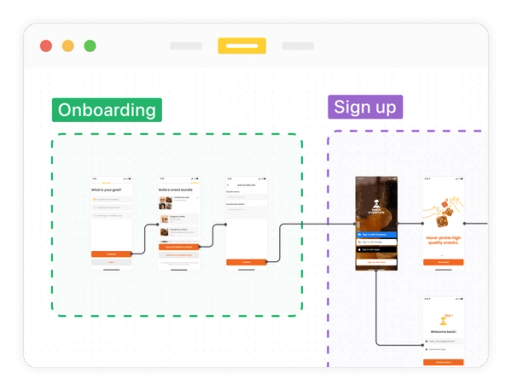
Save time with easy, breezy user journeys
Easily create and maintain user journeys, which are automatically updated any time you publish a new version.